I chose to use an instrumental piece for my music as I wanted something upbeat and something that didnt give out the wrong message.
I chose to use a band called the Vandella's. The music works very well for this video as it is a repetative tune and carries you along with the video.
I am very happy with my final video. I would perhaps try using a tripod next time though as I was not too pleased with how shaky the footage was however this does add to the feeling of walking a
Wednesday, 25 April 2012
Branding - Flash File
These are for my closing sequence. I am really pleased with this and love how the student manages to turn the paper over. Each letter appears on each key frame.
These are the photographs that I took for my main video. I wanted the student to show you around the university occasionally walking towards me, calling me to them, walking behind them etc, this added variety.
I also wanted to get the values of the course over to the potential students hence the brainstorm that develops throughout the sequence, there will be a new point show and developed on each key frame.
Branding - Flash File
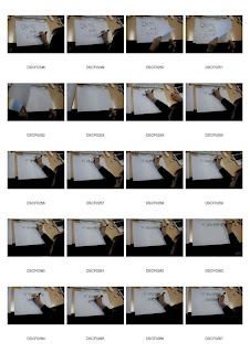
These are the photographs that I took for my opening sequence. I wanted to use a student handwriting the logo for the university. I am very pleased with the overall finish to this sequence.
Branding - Flash File
This is my final storyboard. I want a variety of students to appear in my video however this may be difficult as I am not in university full time and can only attend after 5.30 most evenings and many students have gone home by then.
Branding - Flash File
I want to show a student walking around the university and showing them at different angles. Sometimes they will walk towards the camera, other times I will follow them and then finally the camera will pan around them to show the full view of the area they are standing in.
I also want to feature them writing as I want my video to be as raw as possible and have all the type handwritten.
I also want to feature them writing as I want my video to be as raw as possible and have all the type handwritten.
Branding - Flash File
Taking these photographs helped me to come up with the idea for my final plan. Originally I was going to do it as a tour from my perspective but having taken these photographs I realised that this would be uninteresting therefore I needed to to feature a student in my film to help to add a focus to my video.
Branding - Flash File
These were my initial story boards for my video which showed a tour of the university. Some of the focused on the different studios, some focus on students working, some students receiving lectures and also the facilities of the university.
However I wanted to look more at what the university has to offer so I decided to take some photographs to help me focus on the key features of my video.
Branding - Flash File
This brainstorm shows the things I wanted to feature in my video. These include the facilities, students, security, IT equipment / software and learning spaces.
Branding - Flash File
These were the key points that I wanted to show from my video. Particularly looking at the facilities that are available to the students
Branding - Flash File
This brainstorm shows all advantages of doing Graphic Communication at Wolverhampton University. I wanted to focus on the facilities and the support that you get from tutors.
Thursday, 19 April 2012
Handwriting
I wanted to look at vintage designs. I love the old fashioned postage envelopes, air mail and stamps and want these to be a big feature in my design.
Handwriting
I looked at handwritten fonts and wanted to use Journal. I looked into using a kiss or exclamation mark to add emphasis to the phrase. I really liked the idea of using a kiss though as it was emotional.
Handwriting
I wasn't too pleased with my initial designs and decided to focus on typography as image.
As I was concentrating on handwriting I wanted to use a handwritten font. I asked several people to write out my logo and this inspired me for my final design
As I was concentrating on handwriting I wanted to use a handwritten font. I asked several people to write out my logo and this inspired me for my final design
Subscribe to:
Comments (Atom)


