I could'nt decide on my final logo as I wanted to show how the different cultures come together as a community within Wolverhampton.
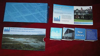
I still really like the city landscape though and after producing my pop up I feel that this one works the best with that design.
Monday, 9 January 2012
Logo - computer generated
I decided I wanted to combine culture and architeture in my designs hence the different colours. I particularly like the blue city scape design and would like to develop this for my final logo.
logo - initial ideas
These are my initial ideas. I wasn't sure if I wanted to show the history of the city, the architecture, the different cultures that live there or the canals and the importance of them.
I also thought about combining the architecture with the culture showing that we all live togetrher.
I also thought about combining the architecture with the culture showing that we all live togetrher.
logo - research
I spent quite a while gathering information about different logo's and brands and seeing how successful companies brand themselves. I then decided to look at country and city logo's. I liked how the different places got the vibe of the place across in the logo for example the spanish logo is showing that it is mediteranean and that it is warm and inviting.
I also like how brands such as coca-cola, boots and baileys that have been around for a long time have kept their original logo's and they are trusted. The companies do not need to rebrand as they are trusted by millions across the world.
I also like how brands such as coca-cola, boots and baileys that have been around for a long time have kept their original logo's and they are trusted. The companies do not need to rebrand as they are trusted by millions across the world.
Pop up final
These are my final designs for my pop up. I am really pleased with how it worked out. I wanted to show progression within the city and showed places that people may not necessarily associate with the city. I wanted to show that it is developing and is modern and feel that my final designs show this.
Pop up vouchers
These designs are for the vouchers that will sit in the tray for my design. The voucher will be given as an incentive to encourage the public to visit the city.
Pop up boxes
These are my initial ideas for my box, I wanted something very plain and simple that showed Wolverhampton as derelict and run down. I wanted to lead people inside the box and see what else the city has to offer.
Pop up blue print
I wanted to produce a blue print that would show development and progress. I will use this for my tray design to show that the city improving.
Pop up cube ideas
These are a few ideas I had for my cube. Originally I wanted to show the old buildings we have in the city and how interesting the history of Wolverhampton is. However after speaking to my tutor it was decided that I would look at modern architecture within the city and how it is developing.
I am really happy with how these developed.
I am really happy with how these developed.
Pop up photo's
I decided I wanted to use buildings that have recently been built to improve the city. This included a library, retail park, new housing estates and a leisure centre.
The buildings that I chose are modern and would appeal to people of all ages which increases the demand of living in Wolverhampton. These buildings are great for the local community.
I took a photo of the derelic land which will be used for my box to show that there are 2 sides to the city.
The buildings that I chose are modern and would appeal to people of all ages which increases the demand of living in Wolverhampton. These buildings are great for the local community.
I took a photo of the derelic land which will be used for my box to show that there are 2 sides to the city.
Pop up initial ideas
These are a few ideas that I had for my design. I wanted to bring architecture into my design and perhaps have a box with some iconic buildings, a 3d map of the city, a 3d pop up postcard etc.
Subscribe to:
Comments (Atom)


