
Showing posts with label Poster. Show all posts
Showing posts with label Poster. Show all posts
Thursday, 19 April 2012
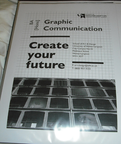
BA Hons poster - final
This is my final design. I wanted the main focus to be on the typography. I took my inspiration from the Bauhaus style. I like their use of elongated type. I also wanted to get a few images into it that relate to the materials used within the course. Finally I looked at my alignments for my type and image.
 Overall I am quite pleased with my final design.

BA Hons poster - computer generated 2nd attempts


BA Hons poster - images


BA Hons - Strapline

BA Hons Poster - ideas


After speaking to my tutors though it was thought that the use of image would be appropriate within my design, I decided I wanted to use the building as I liked the retro feel of the building. My only concern was that it didn't show what the course was about.
BA Hons poster - research
Before starting this project I wanted to get inspiration from other designers. I wanted a retro / typographic poster so I decided to look at artists such as Saul Bass. His designs are very interesting, I like the use of typography and simple use of image and colour. I like that a lot of his designs are only 2 colour.


I am very interested in April Griemans work as well. I like the use of montage and the way she used programs that hadn't really been developed much in the 80's / 90's.
Subscribe to:
Posts (Atom)